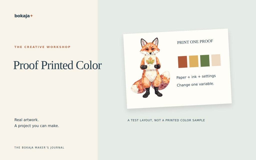
Printed colors look different from screen colors because a screen emits light while paper reflects it. The printer, ink, paper, color-management settings and viewing light all influence the result. A PNG can be perfectly usable and still produce a print that is darker or less vivid than its screen preview.
Choose Autumn Animal Leaf Pressing Club for comparing warm printed colors, or Watercolor Winter Hare Evergreen Postcard Studio for comparing pale detail. Both are paid PNG artwork collections for layouts you design yourself; add your own text, shapes and measurements.
Make it with these Bokaja sets
Choose the style that fits your project. These are digital PNG artwork collections: add your own text and build the layout shown in this guide.

Autumn Animal Leaf Pressing Club
Autumn artwork for comparing warm printed colors.

Watercolor Winter Hare Evergreen Postcard Studio
Winter stationery artwork for comparing pale detail.
Worked example: a two-paper color comparison
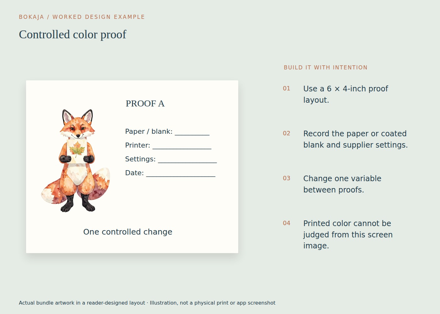
Make a 6 × 4-inch proof card with one 1.5-inch autumn illustration, one 1.5-inch winter illustration and a short line of dark text. The two collections give you different seasonal artwork to compare; inspect the actual selected images for the colors and fine details you care about.
Print the same export once on your usual paper and once on the alternative stock, using the correct media setting for each. Record the paper name and media setting on the reverse. Because the media setting changes with the stock, treat this as a comparison of two paper-and-setting combinations, not proof that paper alone caused every difference.
Judge both prints together under the same ordinary lighting. Look at three things independently: whether dark detail remains distinct, whether pale areas disappear into the paper, and whether the overall mood suits the project. A warmer paper may be attractive for autumn stationery even if it does not resemble a cool screen preview exactly.
If both prints are much darker than expected, lower an excessively bright display before making a comparison, and check the color-management route. Do not immediately add large brightness and saturation adjustments to every source PNG. If only one combination is poor, investigate that stock, its media setting and compatibility first.
Keep one chosen physical proof with a small production note: source artwork, export version, printer, paper and relevant settings. When the next batch looks different, that reference lets you check whether the process changed. Without it, memory of the screen becomes an unreliable color standard.
For work where a specific brand color must be reproduced closely, use the production provider’s supported proofing and color specifications. A home seasonal-card comparison is useful quality control, but it is not a calibrated contract proof.
Identify the kind of mismatch
Describe what you see. Is the whole print too dark? Are bright greens dull? Does a neutral gray look pink? Are only shadow details disappearing? A specific description helps separate a color problem from a clogged-nozzle or paper-setting problem.
Compare the final exported file with the source. If the colors already changed during export, investigate the application workflow before blaming the printer. If the export looks consistent but the paper differs, focus on the printing stage.
Also distinguish appearance from sharpness. More pixels can improve detail at a given size, but they do not automatically correct a color cast.
Make the screen comparison less misleading
A very bright display can make an ordinary print appear unexpectedly dark. View the design at a comfortable display brightness and avoid judging it under dramatically different lighting conditions.
Do not use a phone photograph of the print as the only comparison. The camera applies its own exposure and color processing, and the screen then changes the appearance again. Inspect the physical print in the lighting where it will normally be used.
For color-critical paid production, a calibrated and profiled workflow may be appropriate. For a home craft project, a consistent display setting and a sensible paper proof are often the most useful first steps.
Match the paper setting to the actual paper
Printer drivers use paper settings to control how ink or toner is applied. A generic plain-paper setting may behave differently from the recommended setting for your specific photo or coated craft paper.
Read the paper packaging and the printer’s instructions. Confirm that the paper is compatible with your printer technology and that you are printing on the intended side. Glossy, matte and uncoated surfaces reflect light differently and can make the same file appear more or less saturated.
Use the manufacturer’s maintenance checks if the print has missing bands, uneven color or obvious streaking. Editing the artwork to compensate for a mechanical printing fault creates a file that will be wrong when the printer is working normally.
Avoid conflicting color management
Some workflows let the application manage color; others rely on the printer driver. Applying competing corrections can create unexpected results. Follow the instructions for your application, printer and any supplied paper profile rather than switching several color options at once.
PNG supports RGB and grayscale image data, not a native CMYK color mode. It is commonly used in RGB print workflows. If a professional printer asks for a particular profile or a different production format, follow that specification. Do not assume that an arbitrary online RGB-to-CMYK conversion will improve the print.
Save an untouched master before making production-specific adjustments. A file corrected for one printer and paper may not be suitable for another.
Decide what “matching” needs to mean
A classroom label needs readable contrast and a recognizable symbol. A coordinated wedding stationery set may need closer consistency between pieces. A product sold in multiple batches may require a documented production process and retained reference print.
Set the acceptance standard around the actual use. Some very bright screen colors cannot be reproduced identically by a particular printer and paper combination. In that case, choose a print-friendly palette rather than endlessly chasing the display.
Keep the useful result
Store the final file with the paper name, printer setting and a dated proof. If you change paper, ink or production provider, proof again before a large order.
Your next step
Keep the chosen physical proof with its paper-and-setting record. Use it as the reference for the next batch instead of relying on your memory of a bright screen.
Start with Autumn Animal Leaf Pressing Club, or choose Watercolor Winter Hare Evergreen Postcard Studio for the alternative theme described above. These collections supply PNG illustrations for your own layout; the project text and construction remain yours.
For commercial or shared deliverables, check the current artwork licence for the intended use.