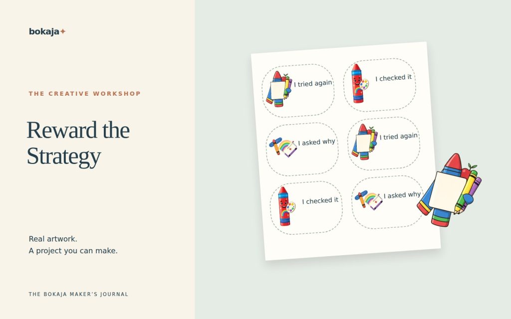
To make reward stickers, begin with the message you want to communicate, then choose a shape and illustration that leave the words readable. A small sticker can acknowledge something specific without becoming a public ranking system or a promise that rewards work the same way for everyone.
Choose Rainbow Crayon Art Studio for creative-process feedback, or Storybook Pencil & Book Club for reading-strategy feedback. Both are paid PNG artwork collections for layouts you design yourself; add your own text, shapes and measurements.
Make it with these Bokaja sets
Choose the style that fits your project. These are digital PNG artwork collections: add your own text and build the layout shown in this guide.
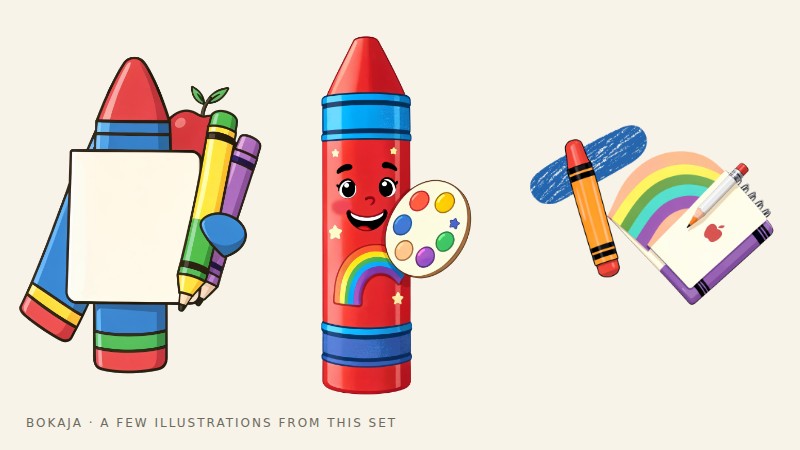
Rainbow Crayon Art Studio
Art-studio artwork for creative-process feedback.

Storybook Pencil & Book Club
Book-club artwork for reading-strategy feedback.
Worked example: a 2-inch sticker that names the useful action
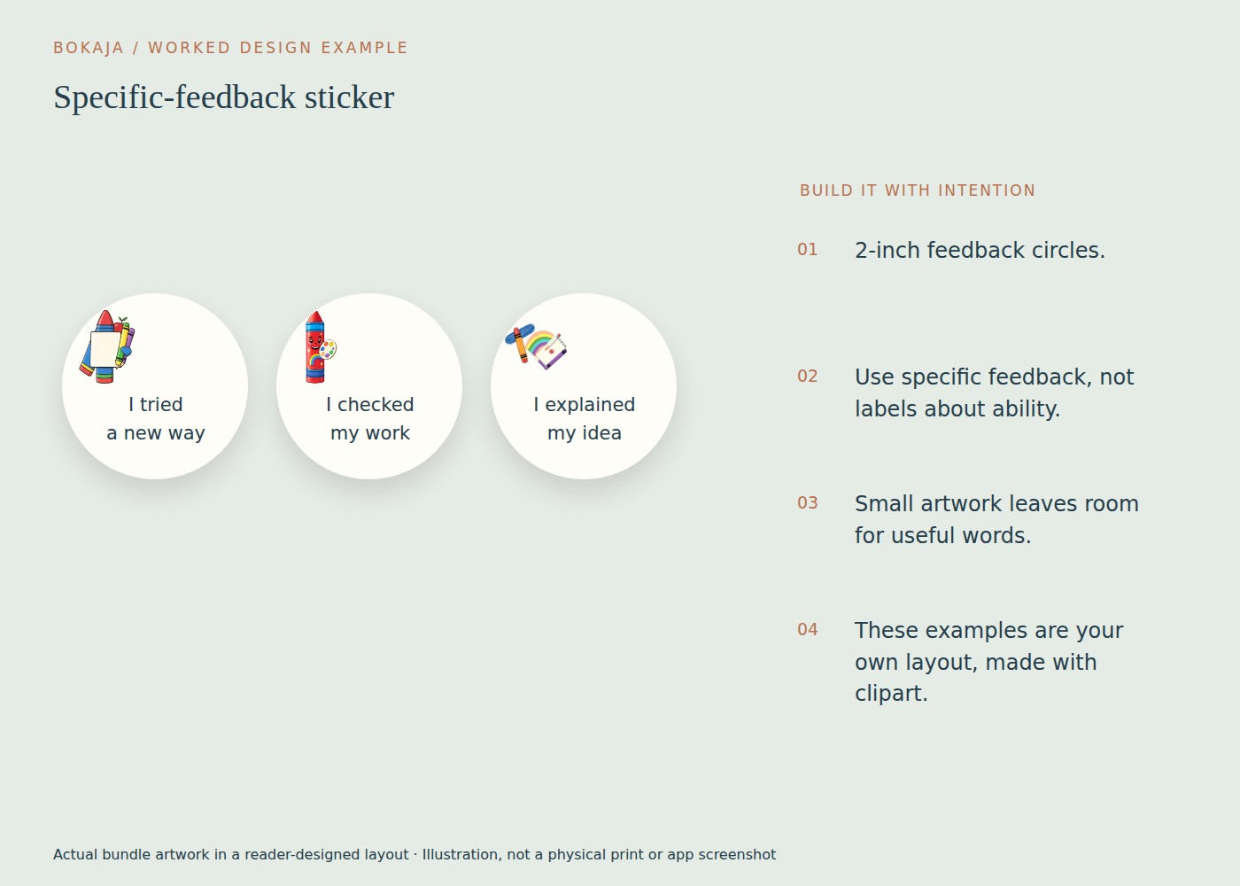
Choose one feedback message before choosing the art. For example, “You checked your work” identifies a repeatable strategy more clearly than a generic “Superstar.” Use a small art-studio illustration to support the message rather than dominate it.
Create a 2 × 2-inch sticker boundary. Keep important content inside a 1.6-inch-wide central area, leaving about 0.2 inch at each side. Place a 0.6-inch illustration near the top and use two or three short lines of text beneath it. Start around 11–12 points, then judge the actual printed typeface and viewing distance.
Make three messages in the same structure: “You tried another way,” “You asked a useful question” and “You checked your work.” These are examples to adapt to an action you genuinely observed, not labels to apply automatically. Keep the image size and text location consistent so the wording carries the difference.
If the type becomes too small, reduce the illustration or make the sticker larger. Curving a long sentence around a tiny circle often makes it harder to read. A simple rounded rectangle may suit the message better than a circle.
Print one of each message and read them at normal handling distance. Check that the pale artwork does not compete with the text and that the complete cut border includes the entire composition. For machine cutting, prepare the backing and printed layers as one intended sticker and inspect the cut preview.
Offer feedback in a way that suits the learner and setting. Some people prefer a private spoken comment or a note to a visible reward. The design is successful when the message is specific and welcome, not when every page receives another sticker.
Write the messages first
Choose short, specific wording. “You tried a new approach,” “Thanks for helping,” or “You asked a thoughtful question” tells the recipient what was noticed. Generic praise can be fine, but avoid making every sticker a judgment about a person’s fixed ability.
Do not label a child as the “best” or compare them with classmates unless the activity genuinely calls for a competition and the setting supports it. A sticker can acknowledge effort or a contribution without announcing a winner.
Keep the language appropriate to the recipient and context. Some people prefer quiet verbal feedback or no public reward at all. The design should support the relationship, not dictate it.
Choose one visual style
A small animal, food character or classroom object can create a friendly theme. Use a consistent scale and keep the image subordinate to the message when the message is the point.
Do not put text across a busy illustration. Try the image above the words or beside them. If the design will be used in grayscale, check that its contrast survives without color.
Build a modest first sheet
Start with perhaps four messages and a few copies of each. That is enough to test readability and usefulness without producing a large stock of wording you may want to change.
For hand-cut stickers, a rectangular grid can be efficient. For a compatible cutting-machine workflow, prepare the intended outer shapes and inspect the Print Then Cut preview. The printer prints the sheet; the machine cuts it.
Keep the source images and text editable in the master. If one phrase needs revision, you should not have to rebuild every sticker from a flattened screenshot.
Select paper for the actual use
Choose printable sticker paper compatible with your printer. Consider where the sticker will go: plain paper, a notebook cover or another surface. Adhesive strength, finish and removability vary.
Do not describe a sticker as waterproof, washable or safe for skin unless the actual material and finished product support that claim. Ordinary printable paper is not a general-purpose product label for every environment.
If children will handle the stickers, consider the backing, small pieces and application context. Follow relevant school or activity guidance rather than treating craft materials as automatically suitable for all uses.
Make the proof do real work
Print one small sheet at the intended scale. Read the smallest phrase under normal lighting. Cut and peel a few examples, then apply them to scrap material similar to the final surface.
Check whether the words remain clear after application and whether the border tolerates your cutting accuracy. A design that looks attractive enlarged on screen can become an unreadable colored dot at sticker size.
If you use a machine, test the actual paper and blade setup before producing the batch. There is no universal pressure setting for every sticker stock.
Use the stickers thoughtfully
Keep the supply accessible to the adult or activity leader without making the display a scoreboard. Explain the acknowledgment in words where that is helpful. Review whether the stickers are serving their purpose rather than increasing the quantity automatically.
Save a dated master and a short note on the paper and settings. For classroom storage labels, use the separate label-making guide; identifying a bin and acknowledging a contribution are different design tasks.
Before selling finished physical stickers, review the current artwork licence. Do not share the original PNGs or assume that a printable digital sticker pack is covered by the same permission.
Your next step
Choose feedback that describes something you genuinely noticed. Keep the readable sticker master and revise the wording as needs change instead of stockpiling generic rewards.
Start with Rainbow Crayon Art Studio, or choose Storybook Pencil & Book Club for the alternative theme described above. These collections supply PNG illustrations for your own layout; the project text and construction remain yours.